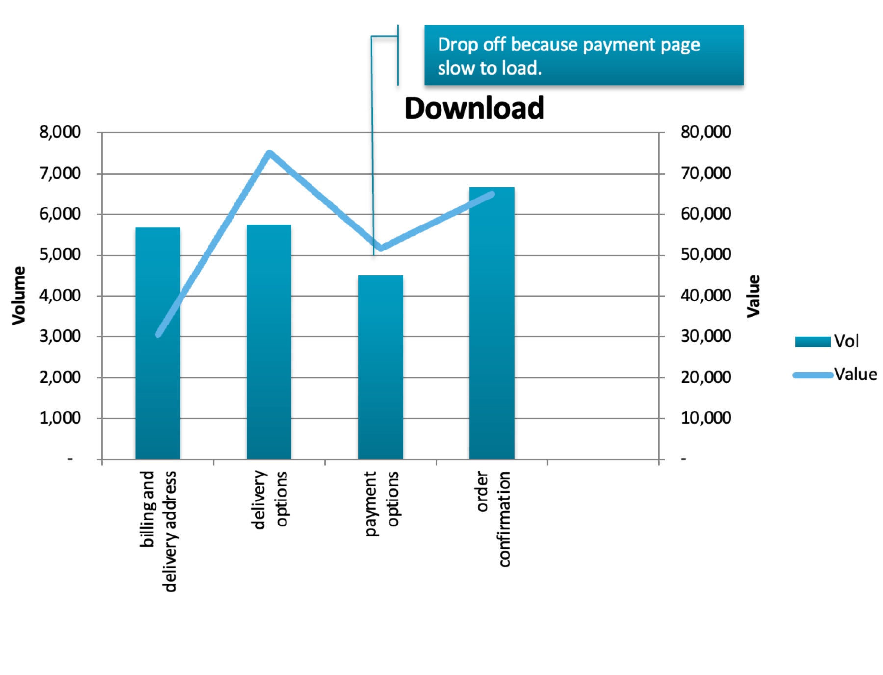
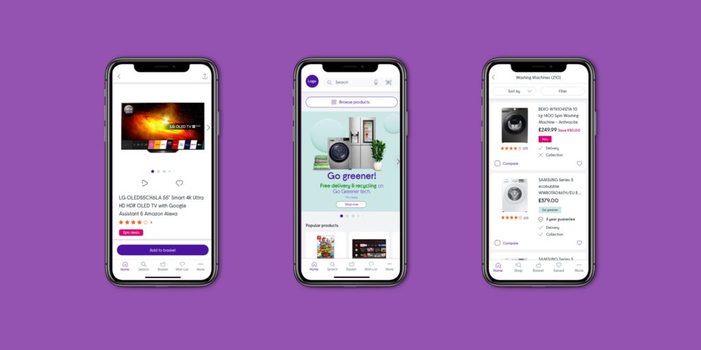
The previous Currys checkout was difficult to use, slow, and had high drop-off rates at various stages. Form fields were hard to fill in and the experience was not optimised for mobile devices.
Checkout Redesign
To create a new checkout experience that reduces friction, drop-offs, and allows customers to quickly add information to complete the order on all breakpoints.
I created a single-page checkout where all customer data is added on one page. This increased progression to the checkout by 1.88%, resulting in an additional £10m YOY.
Discovery
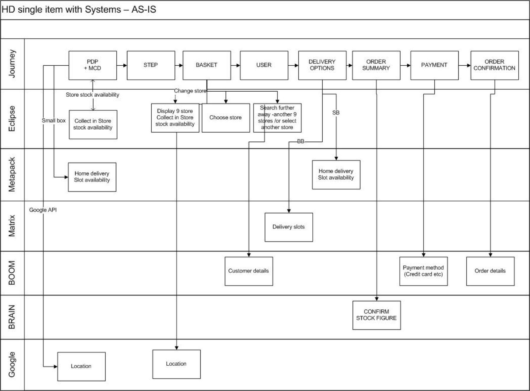
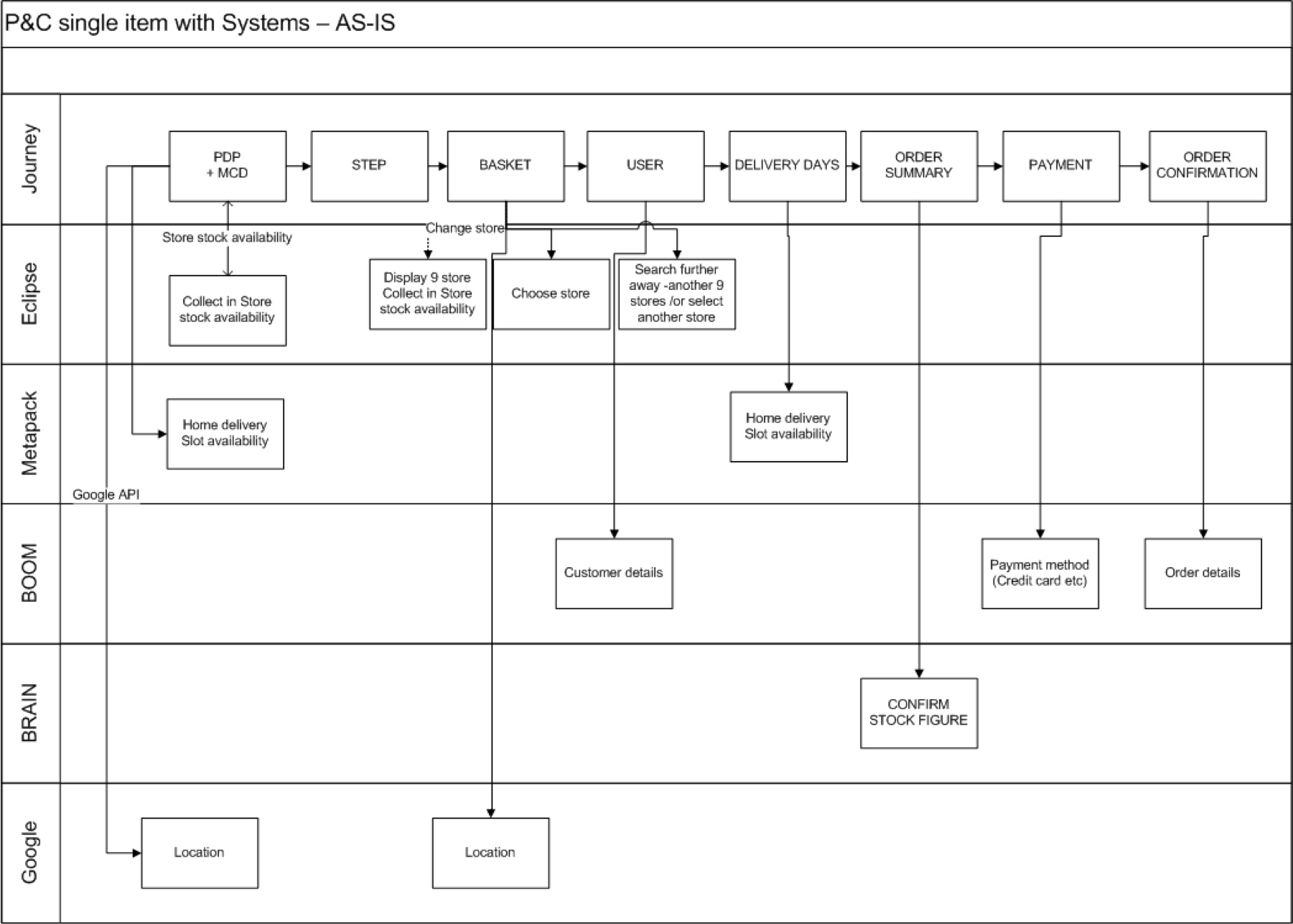
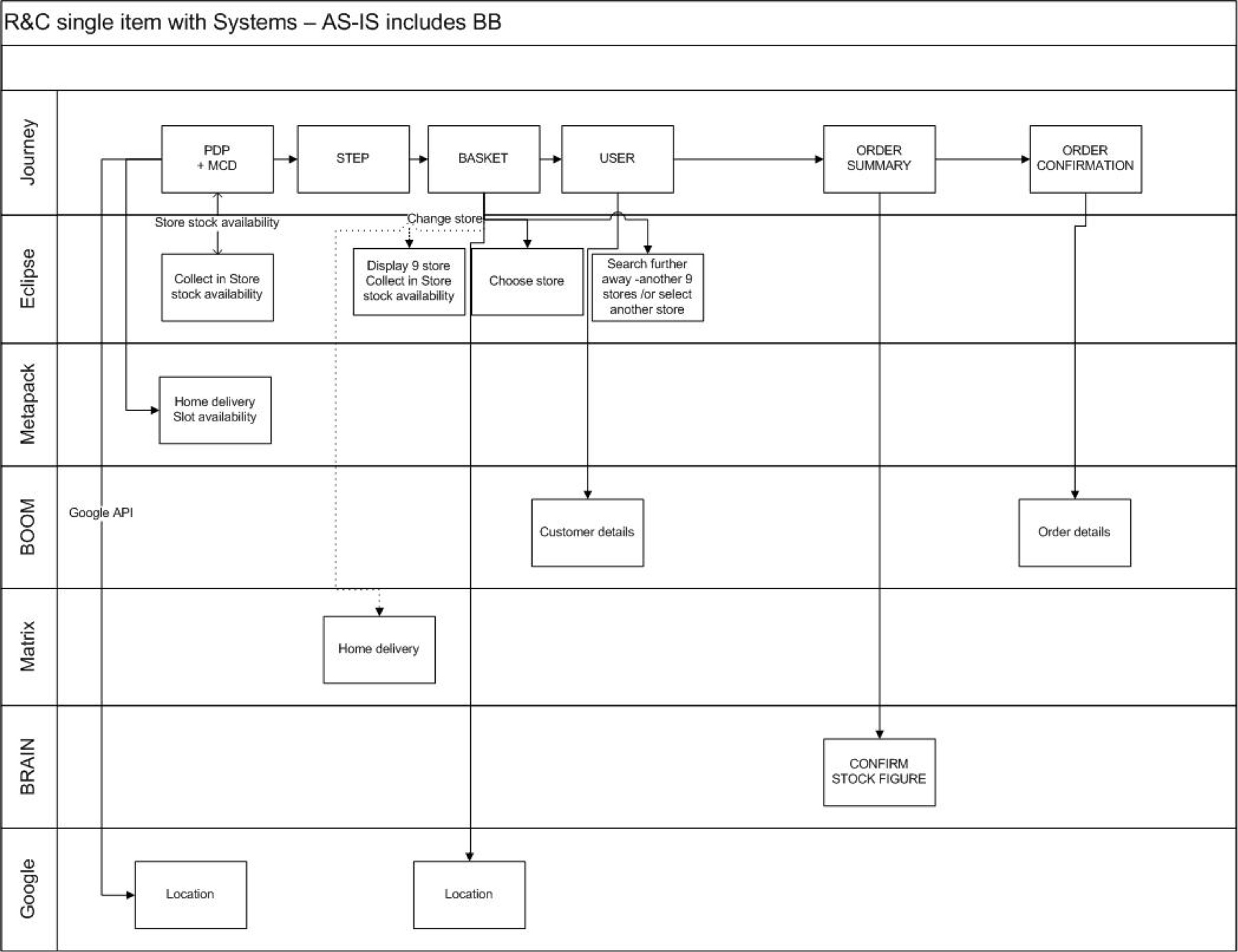
Working with BAs and Solution Architects, I mapped out all the different systems and touch-points that the current checkout was linked to. This ensured nothing would be missed during the redesign.
Research
Analysing competitors, I noticed a lot of customer data was pre-filled and saved from previous sessions, such as addresses and payment details.

Ideation
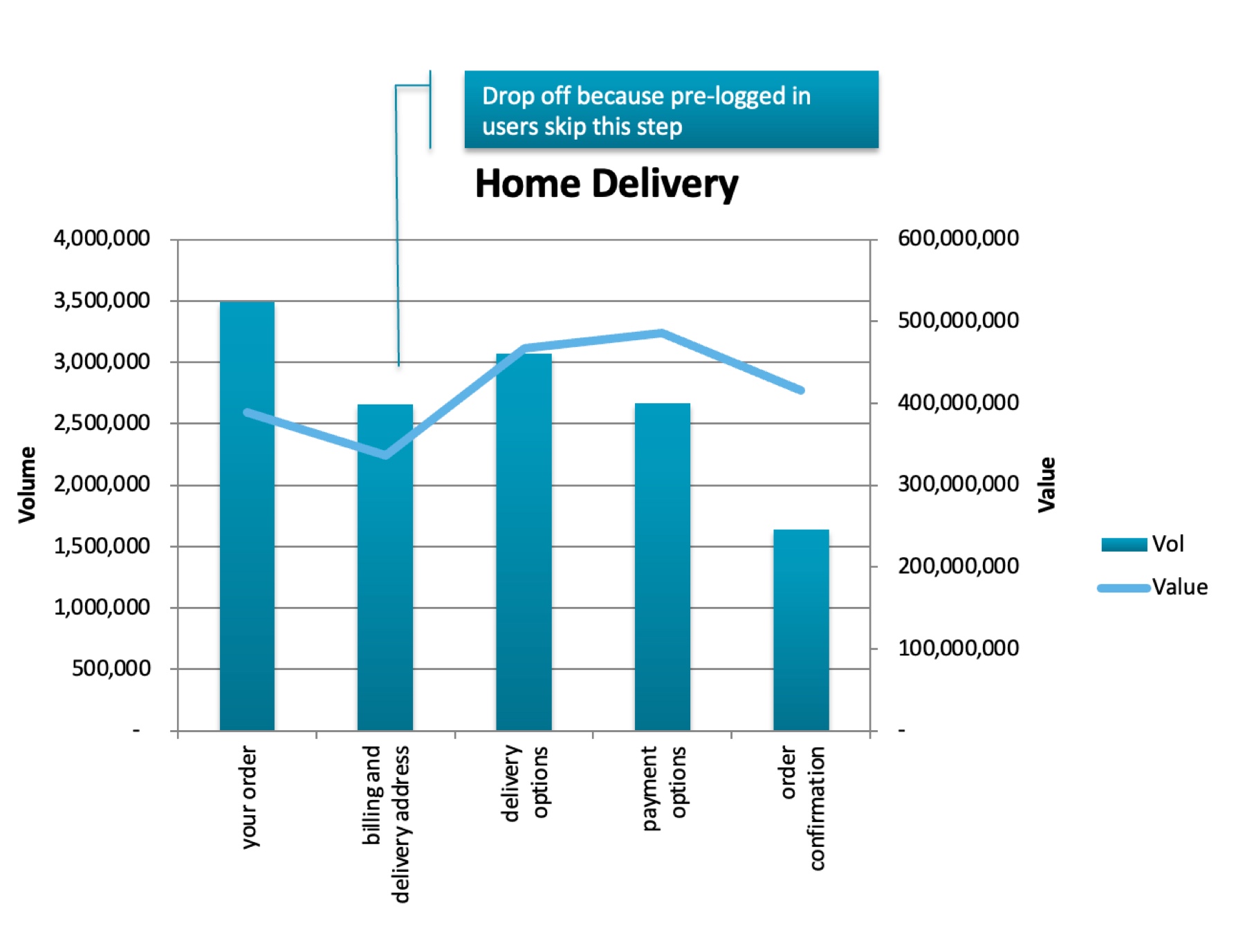
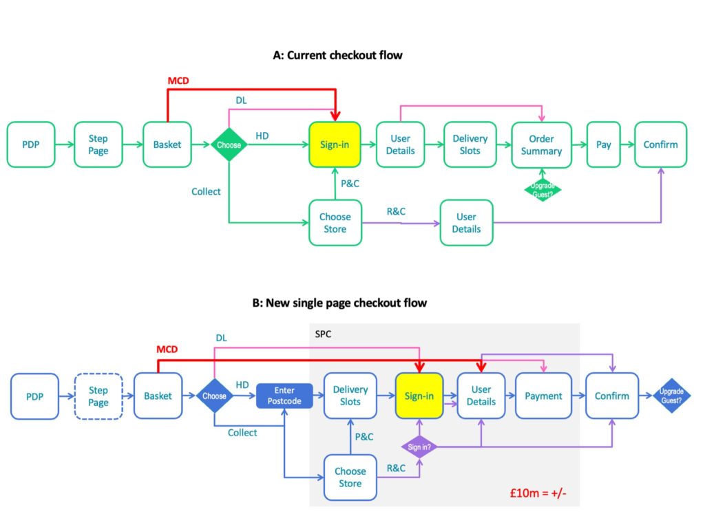
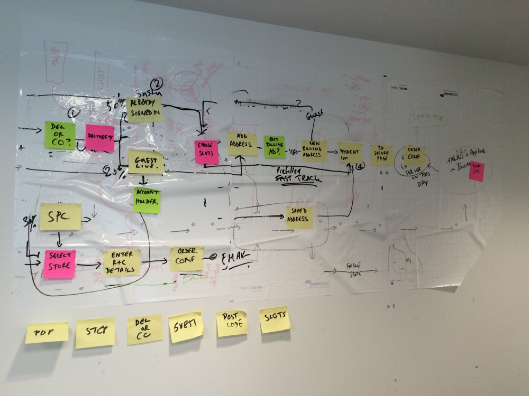
I organised a flow workshop with developers, BAs, and Solution Architects to understand the current flow using post-it notes. Leveraging team knowledge and analytics, I reordered the checkout flow.
New checkout flow
Changes included:
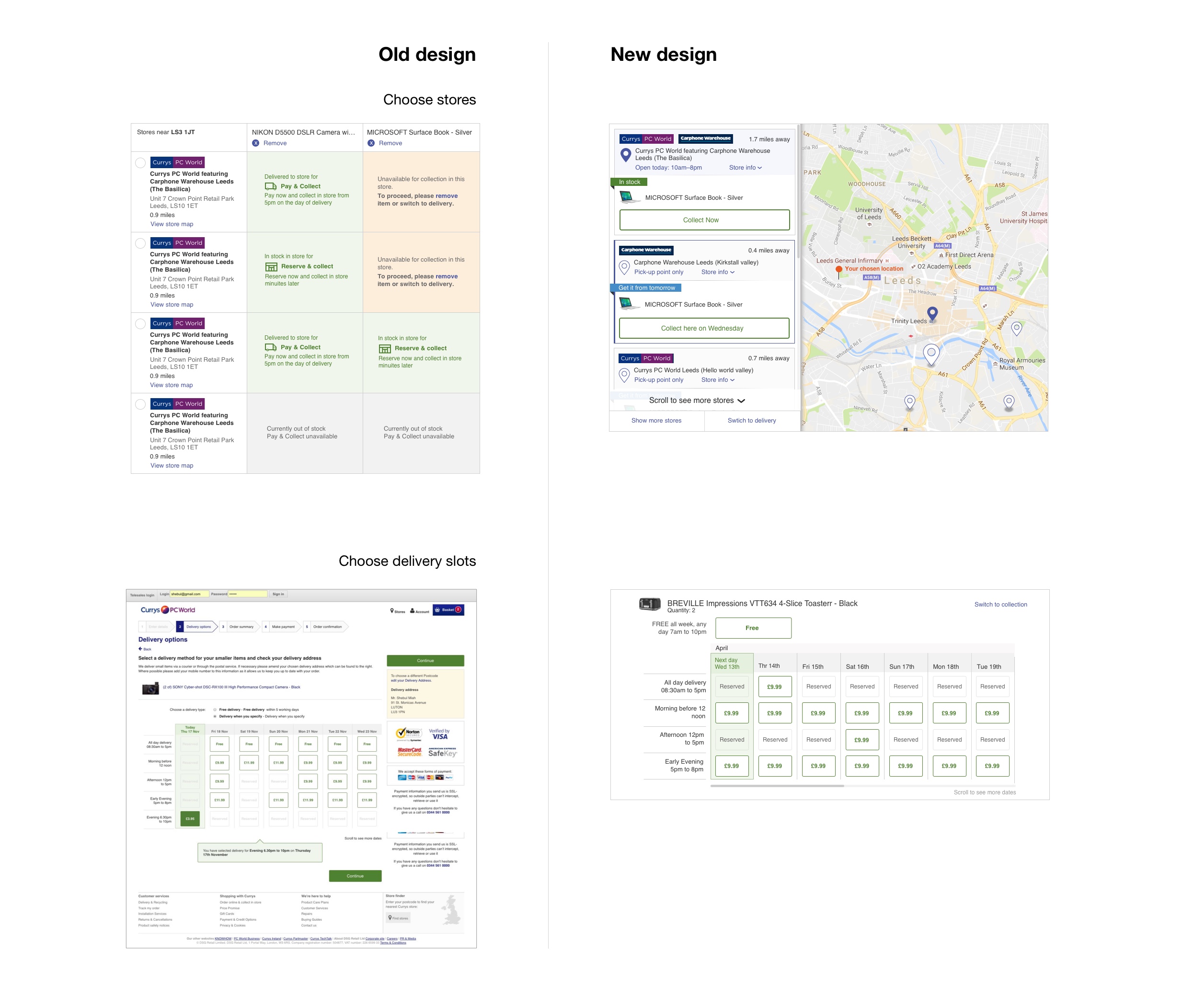
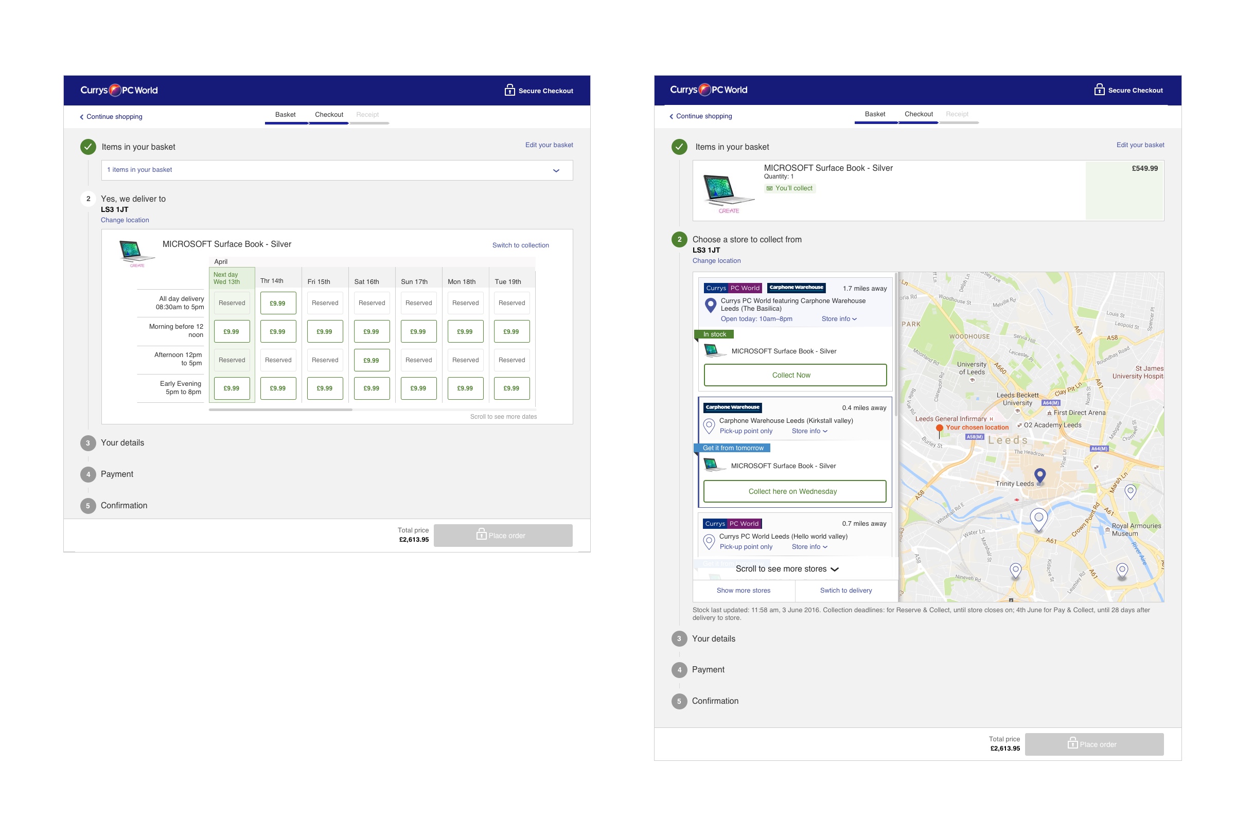
• Allowing customers to choose delivery slots without signing in
• Enabling store selection by entering a location
• Pushing guest upgrades at the end of the checkout process
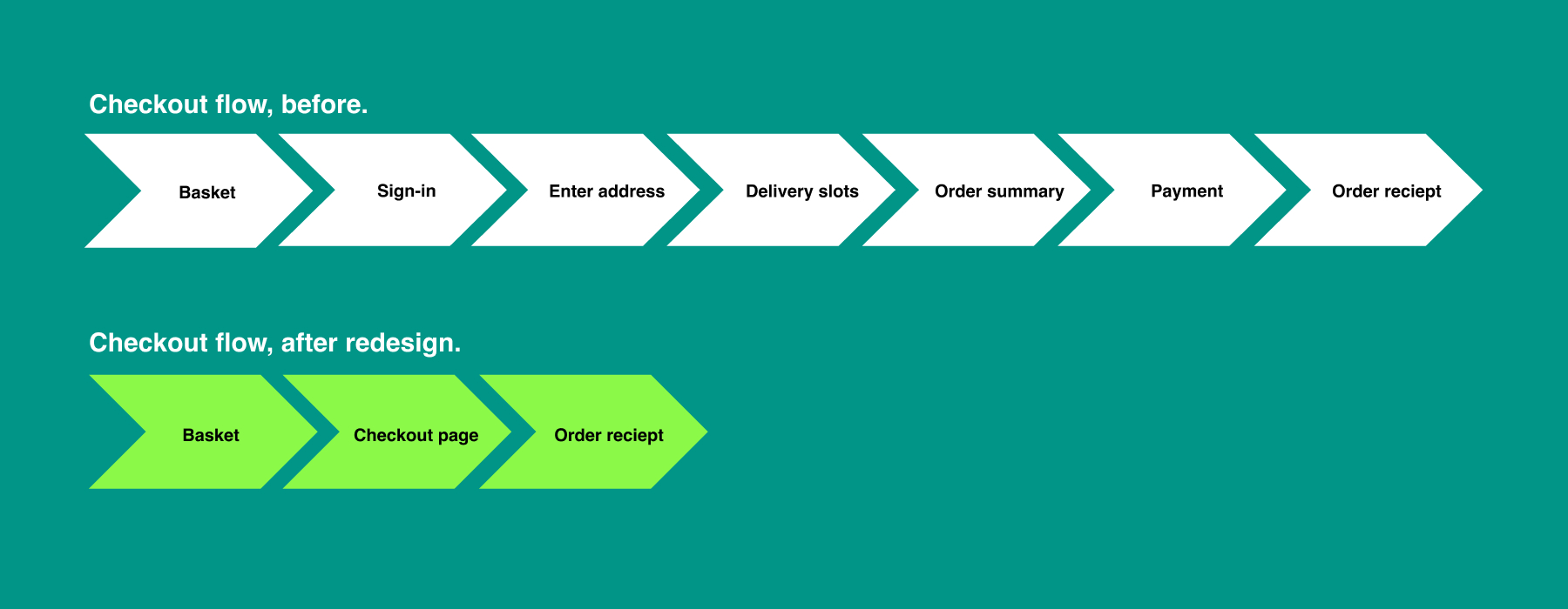
• Consolidating five pages of the checkout into a single-page application
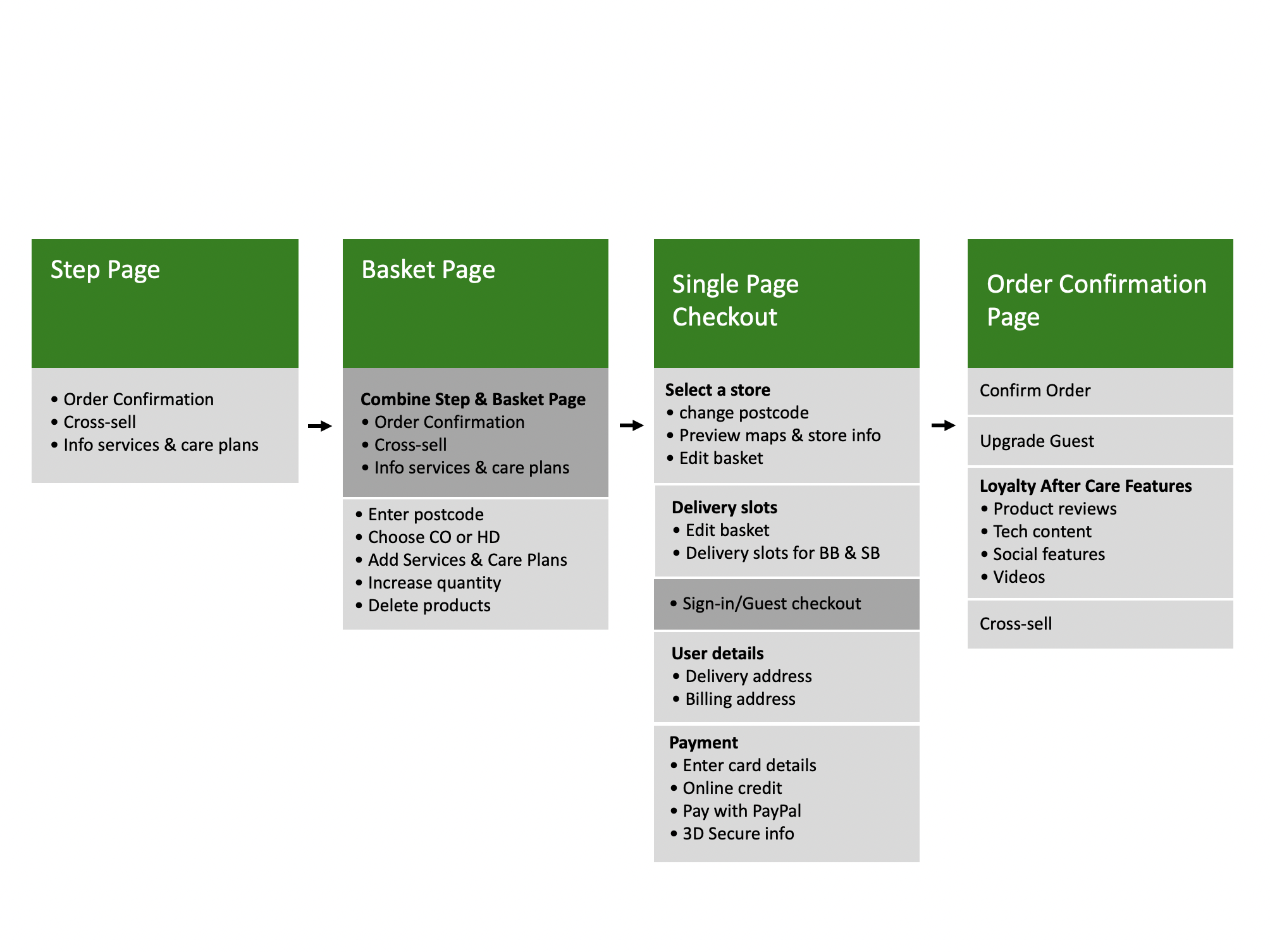
Page goals and reducing clicks
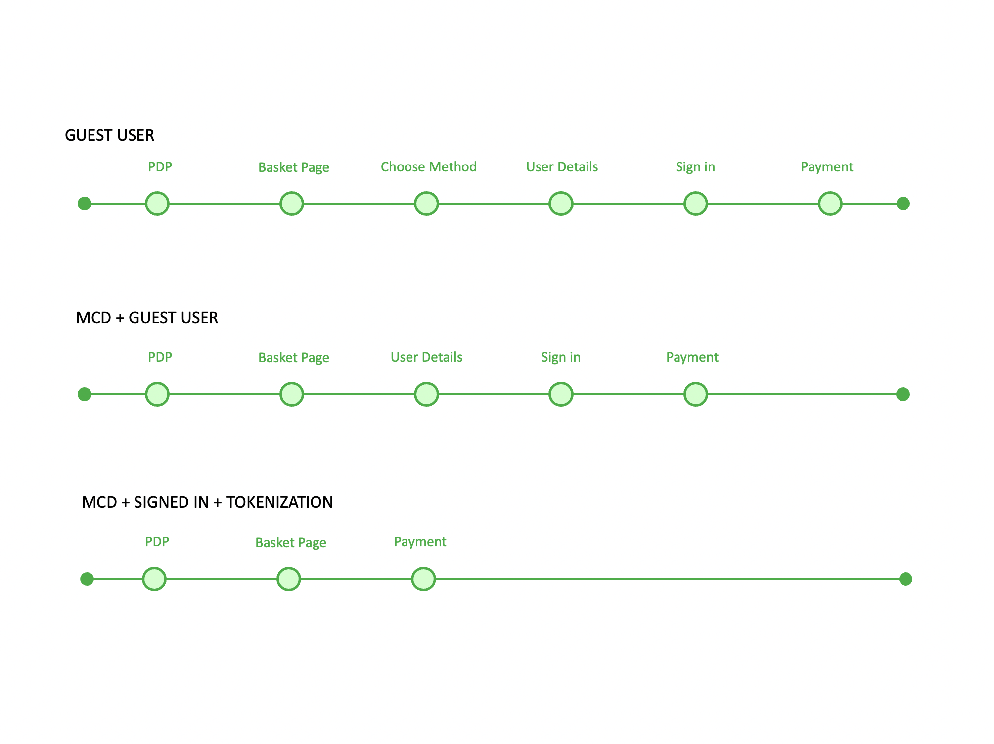
I created a checkout goals page to show stakeholders where each feature would sit on which page. The step journey on the right shows the more data I can save about the customer, the more quicker a customer can complete the order.
Design
The old checkout had many hard-to-use components. I redesigned each component to be usable and fit into a single-page checkout.
Final UI Design
The final UI design allows choosing delivery slots or store collection without signing in. As users complete each section, it collapses, giving a perception of speed. This design suits both single orders and mixed baskets.
Usability lab testing
I created a prototype using Axure and hired an external testing company to validate the experience. Feedback was iterated back into the design before launch.
Positive:
-
Well-structured single-page checkout
-
Good form usability
-
Clean, clutter-free design
Negative:
-
Need for GDPR-compliant marketing opt-ins
-
Improvement needed in copy
-
Indication of mandatory fields
Implement
The new checkout project was launched incrementally:
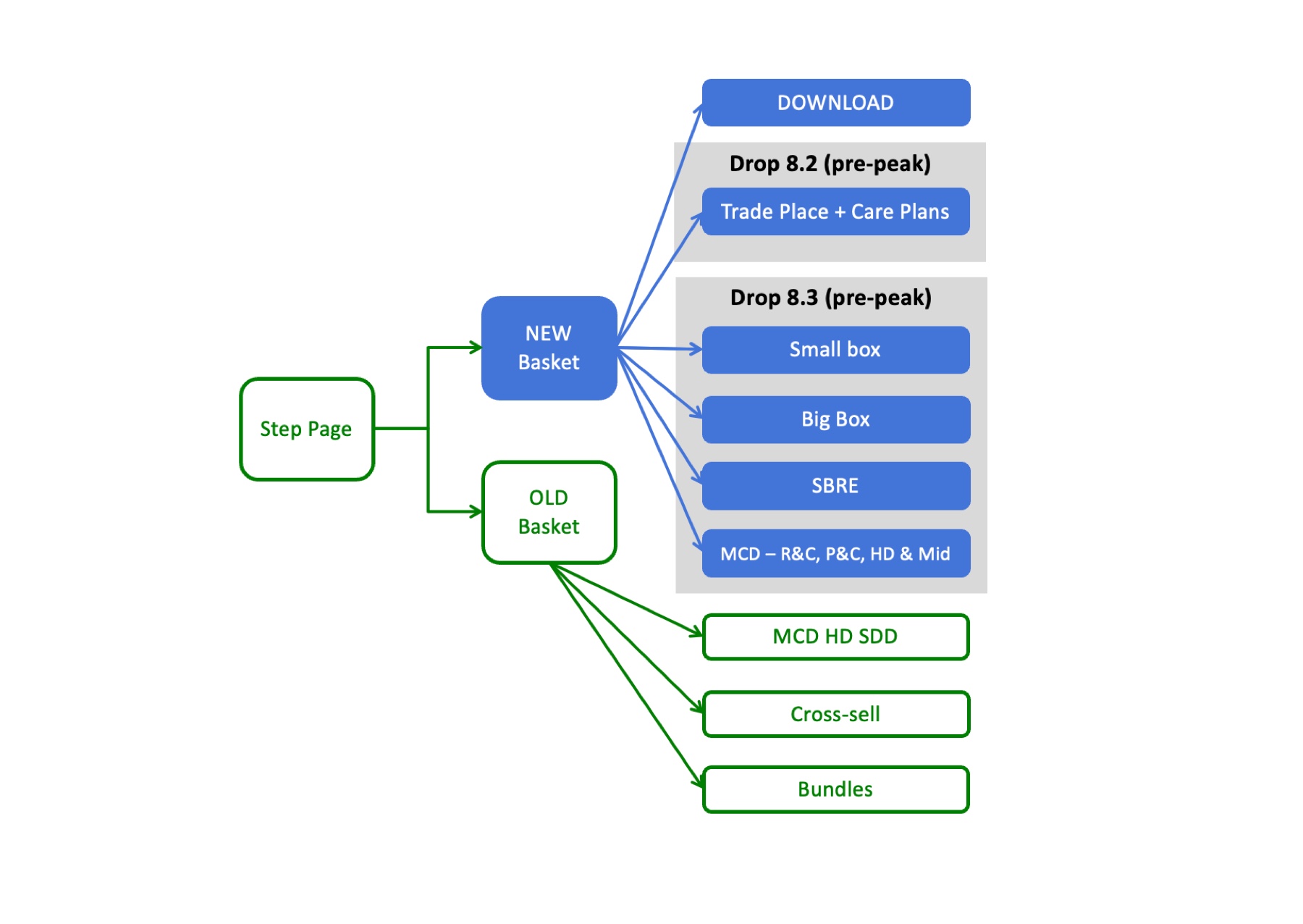
• New basket page
• New basket page with product insurance
• End-to-end download journey
• End-to-end small items journey
During the release process, the old and new checkouts ran in parallel until the new checkout was fully implemented.
Evaluation
For each increment released, I:
• Monitored data on release day
• Conducted UAT before and after release
• Assessed incremental benefits
• Provided stakeholder walkthroughs
• Prepared designs for the next increment
Result
By conducting extensive research, testing, designing, and prototyping, I mapped out the entire single-page checkout experience and launched it incrementally.
Checkout progression
The single-page checkout increased progression by 1.88%, indicating fewer drop-offs and more completed orders.
Checkout revenue
A 1.88% increase in revenue translated to an additional £10m YOY, thanks to reduced friction and barriers.
Small items mobile conversion
Redesigning the delivery slots and store selection optimised the mobile site, improving mobile orders.
Large items mobile conversion
Optimising the mobile experience for large products increased mobile conversion to 5%.
Basket insurance increase
An A/B test of the basket insurance options highlighted the benefits of each option, increasing conversion by 4.2% and generating £1.3m YOY.
