Currys App
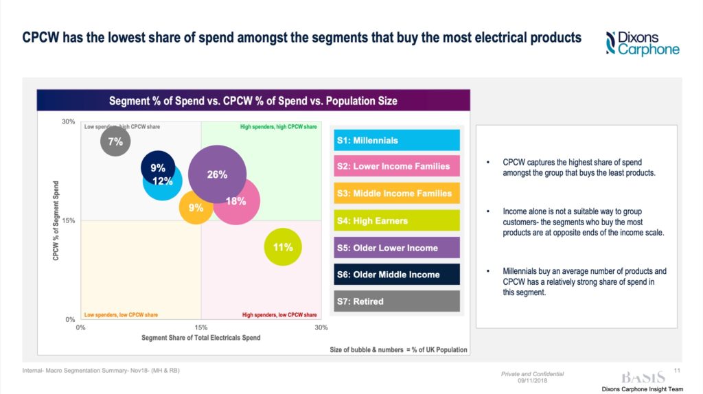
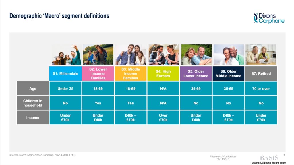
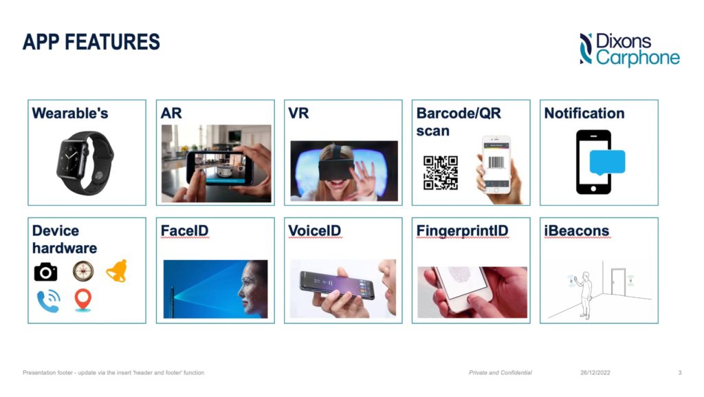
During the discovery phase, I examined Currys’ customer segmentation to understand the target audience for the apps, which helped steer the experience and design. I also researched app capabilities to brainstorm potential features.
Platform analysis
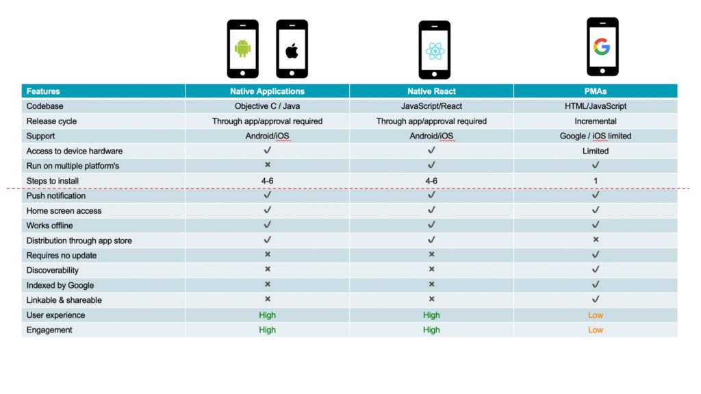
I helped the business decide on a native solution despite its higher development cost and longer download process, as it offered the best experience and engagement compared to other platforms.
Research
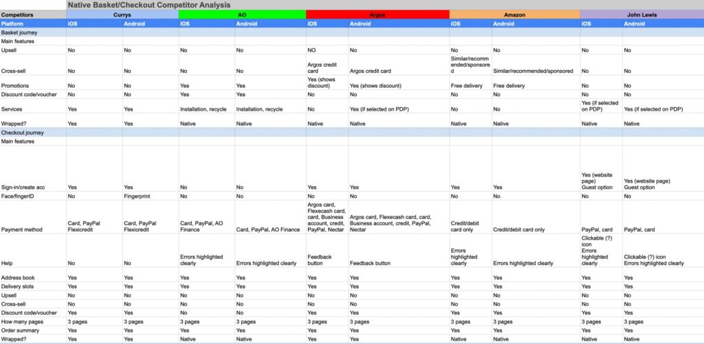
I conducted a competitor landscape analysis, using competitor apps, reading app store comments, and making orders to identify pain points. Key findings included:
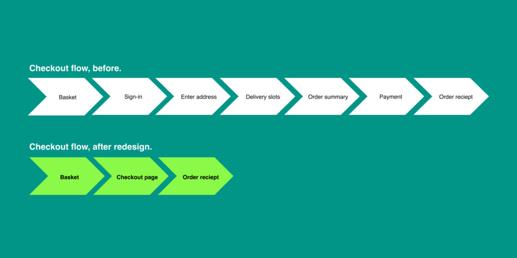
• Wrapped basket/checkout processes
• Slow app load times
• Too many clicks to purchase
• Broken journeys
• Outdated experiences
Ideation
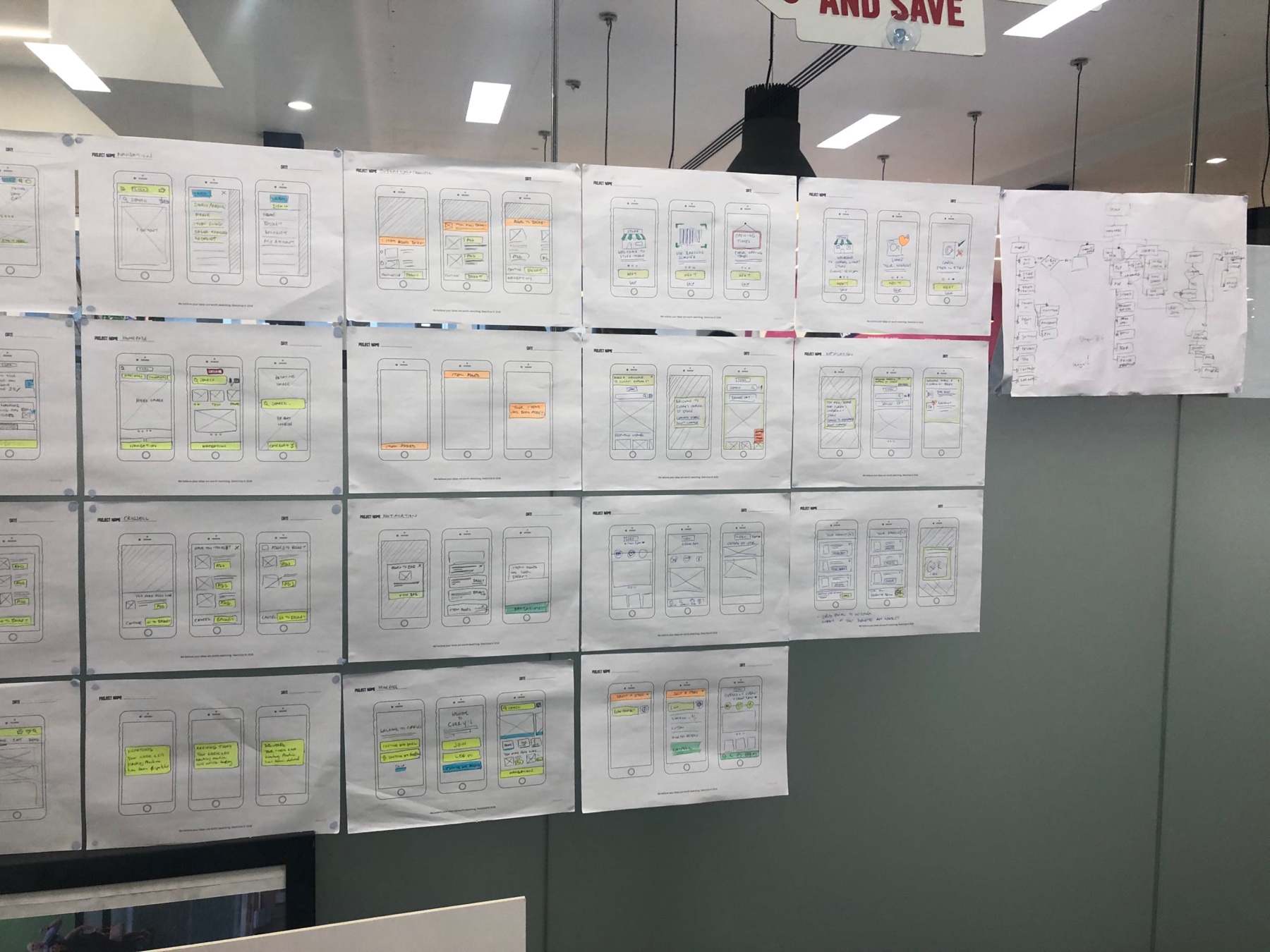
I sketched the user journey on paper, considering different states, error cases, and interactions. Sketching allowed for experimental designs and collaboration with team members to create various solutions.
User flows
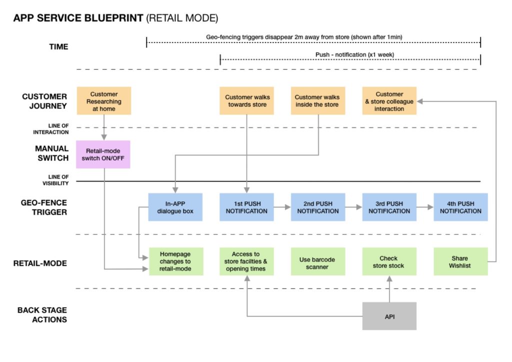
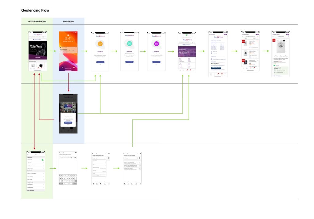
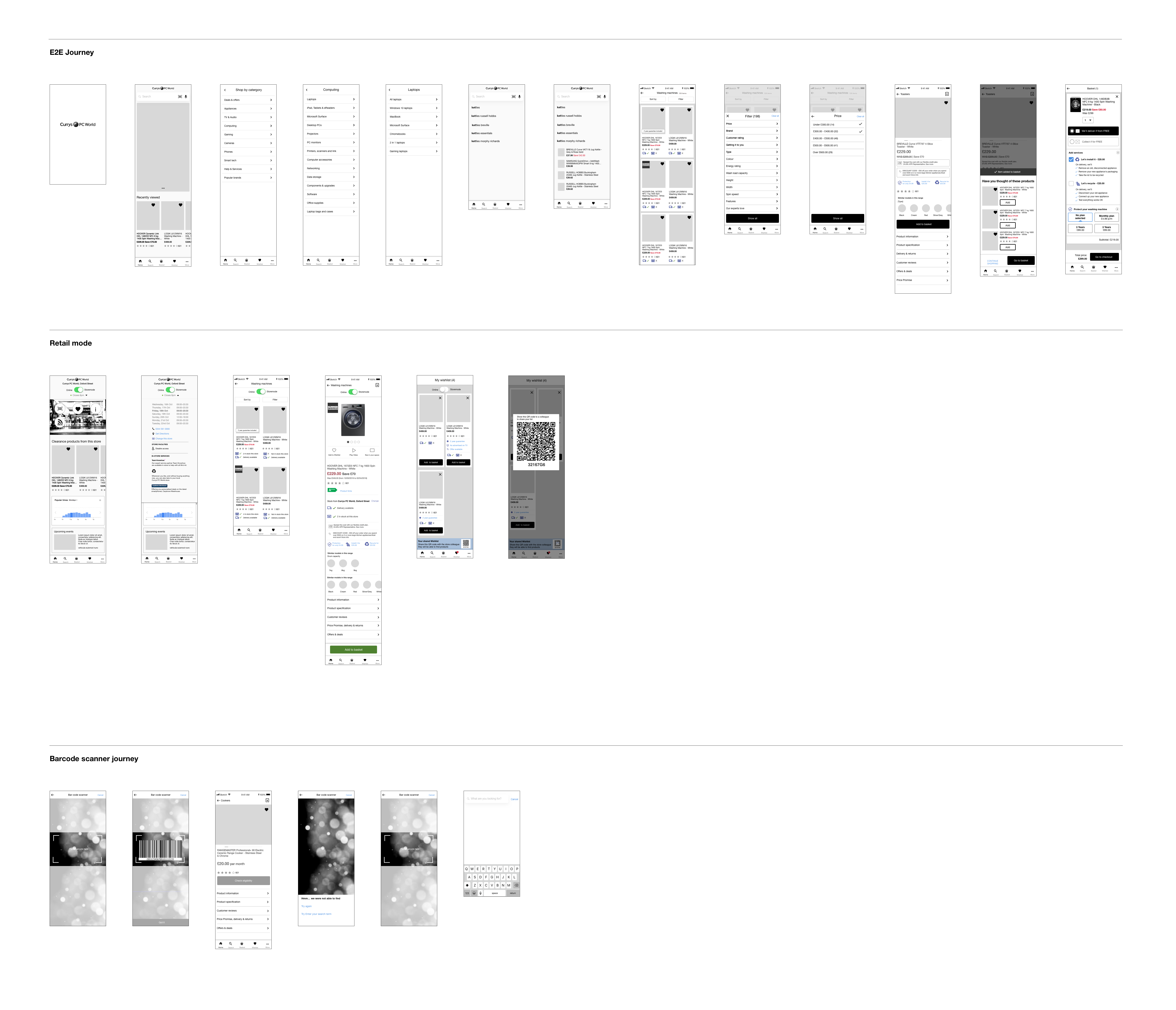
After sketching the user journey, I mapped out the user flows to communicate the customer journey to stakeholders.
Design
Using Sketch, I wireframed the journeys and identified components for the design system. I presented these wireframes to stakeholders as a storyboard.
Testing
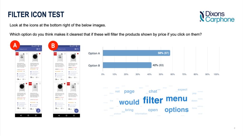
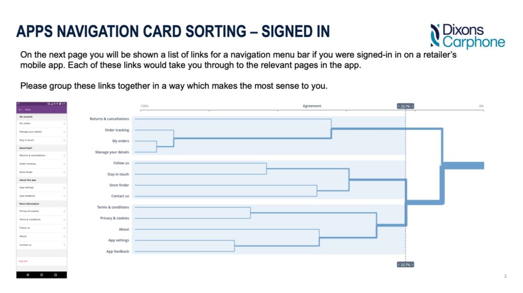
I used UserZoom to test and validate wireframes, addressing issues early before development.
Final UI Design
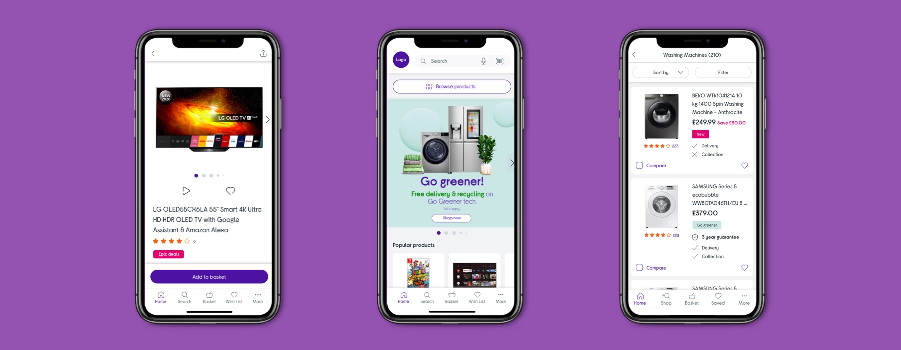
I created the final UI design, applying grids, typography, spacing, padding, and different component states. These designs were uploaded to Zeplin for collaboration with copywriters and developers.

Implementation
I worked with developers to build the app screens. Key activities included:
• Design walkthroughs with developers
• Redesigning screens for technical feasibility
• Lab testing with users
• UAT testing to ensure product readiness
• Stakeholder walkthroughs and sign-off before launch
Evaluation
Post-launch, I continued to evaluate app performance by:
• Monitoring analytics on release day
• Reading App Store feedback
• Reviewing site survey comments
• Monitoring NPS scores
Result
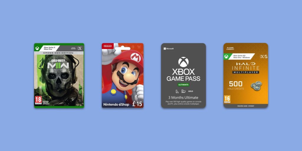
The apps launched within 7 sprints, just in time for Black Friday. Popular products sold included Apple AirPods, iPads, and PlayStation games.
£1m revenue in 3 days
Three days after launch, the apps generated £1m in revenue due to their easy-to-use, frictionless design.
App store rating
Customers rated the new apps 4.5 stars, praising their fast load times and simple design.
Apps
Despite a tight deadline of 7 sprints and the upcoming Black Friday event, I successfully designed and launched both Android and iOS apps without issues.
